Jack and Charlie’s Nursery: Part One
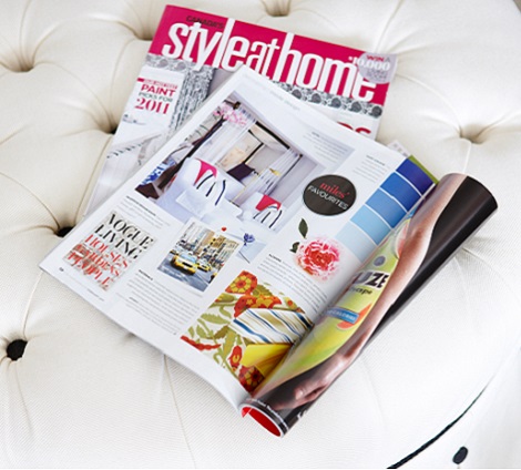
Nurseries are one of the most popular and fun spaces to decorate (at least according to my pinterest feed), so where do you start when you’re a decorator and finally designing your very first baby room for your own littles? Now that the April issue of Style At Home is out on newsstands, I can finally share how I designed Jack and Charlie’s nursery. (click here to read the full magazine article)
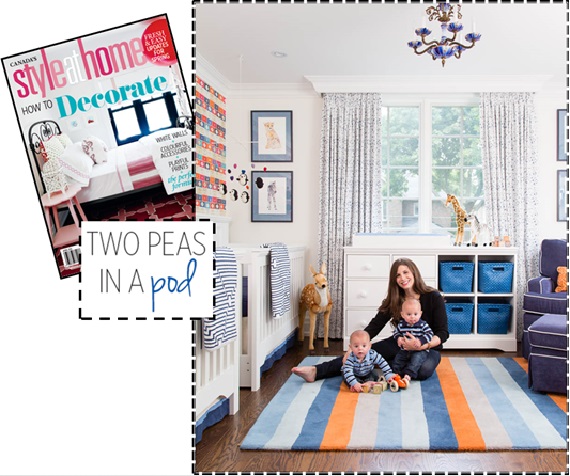
In the days leading up to my first ultrasound, I let myself fantasize over the pretty fabric samples I had been hoarding over the years for my future little girl’s room. (As one of four girls, I was convinced I would be giving birth to at least one little lady down the line) When I found out I was having identical twin boys (what the what?) I had to throw out most of the ideas and start from scratch. Luckily there was one well-suited print I had tucked away at the back of my mind.
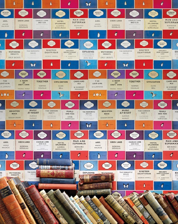
As a design editor at a decorating magazine, I received media releases about new fabric and wallpaper collections almost every week. As soon as the press package for Osborne and Little’s Penguin Library wallpaper crossed my desk I knew I would be using it some day down the line in a project. It was just so me. The bright colour covers mixed with the black and white penguin branding makes for serious eye candy and I couldn’t resist the sense of retro nostalgia it evokes.
The wallpaper appealed to me for the nursery for a number of reasons. I loved the idea of fostering a love of books with my boys right from the start and I thought it was a safe investment to choose something gender neutral with such a wide array of colours to work with. I pulled out navy, sky blue, periwinkle and orange as my main palette but the room could suit a little girl if ever need be in the future with a few easy changes, such as a new purple small area rug, or hot pink bedding and accessories. The paper is also sophisticated enough that the room could become our office one day – book themed wallpaper is fairly academic after all!
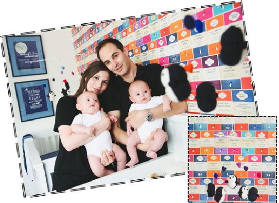
Playing on the penguin theme, I ordered cutie pie felted mobiles from needlenerd. I found Bonnie’s work on etsy and was delighted to discover she lived right here in Toronto. She was kind enough to match the colours of the hearts in the mobile to the colours seen in the wallpaper so they coordinate perfectly. A fun fact is newborns only see in black white the first few weeks as their eyes develop, so the boys were madly in love with gazing up at the black and white penguins!
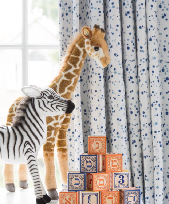
The other main print in the room is the fabulous splatter embroidered drapery fabric, Skittles, from Lulu DK children’s collection for Schumacher. The sky blue has a purplish undertone so it doesn’t scream “little boys only” and the print is youthful while still being chic and timeless. Investing in black out lined drapery was imperative to maintaining a good nap schedule- good window treatments (with brackets to keep dangling cords out of harm’s way) is one area of nursery decor that you should not skimp on!
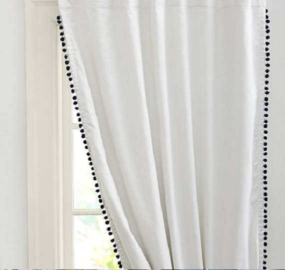
In a perfect world I’d have added extra embellishment with navy pom fringe on the leading edge of the drapery panels, like these ready-made panels from PB Teen, and the perimeter of the roman shade, but I had to exercise restraint for budget sake. Budget also meant I couldn’t paint out the ceiling in a soft sky blue- something I was also was keen on doing to punch up the white envelope of the room.
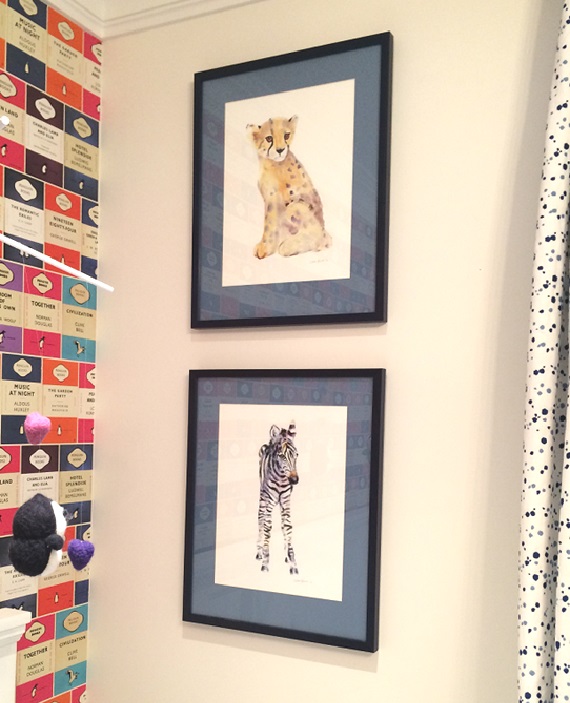
To balance out the strong patterns of the drapery and accent wallpaper behind the crib, I decided to go bold with the framing of my artwork on either side of the window. I chose navy frames with periwinkle mats from PI Fine Art for the lovely watercolours I purchased from Mary’s Flower Garden on etsy. Both my husband and I are major animal lovers and so we welcomes the idea of adding more fauna into the existing penguin mix.
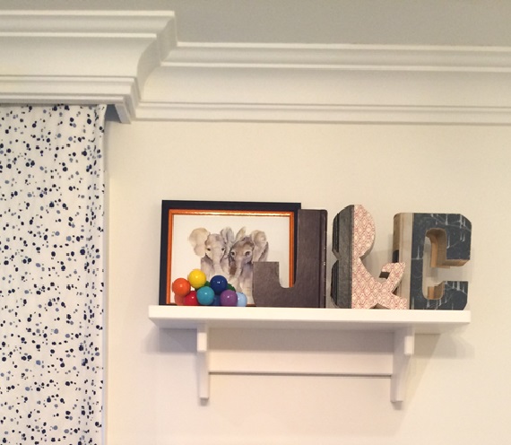
This snapshot also shows a separate little watercolour we purchased of two baby elephants together. We framed these twin babies without the blue mat, but added an orange filler to the frame to tie in our accent colour. The shelf also shows off whimsical letters made out of old library books from Anthropologie that serve as another extension of the book theme.
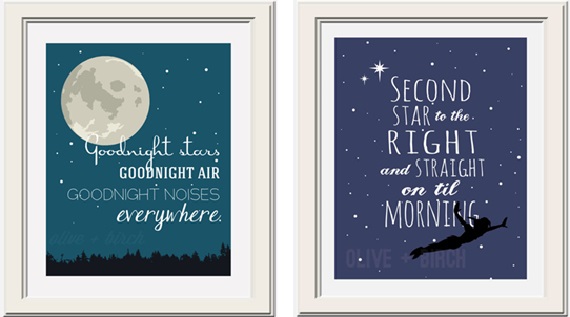
The last literary nod comes courtesy of the artwork on the other side of the cribs by Olive and Birch, another etsy artist. They feature favourite quotes from two of my top children’s books, Peter Pan and Goodnight Moon. What a sweet send off into slumber!
For details on the furniture and accessories stay tuned for part two!
(Top photo and baby blocks photos by Donna Griffith, Family shot with mobiles by Scarlett O’Neill)
Categorized as: Babies, Dream Home, Jessica Claire Interiors, Nursery, Style At Home
Tagged As: anthropologie, etsy, goodnight moon print, lulu dk skittles, nursery, osborne and little, pom fringe, wallpaper

POST A COMMENT