Tag: cameo
Project Glam Kitchen: Millwork
I looked into big-box cabinetry options for the kitchen millwork, but after not being able to find a shaker door style and finish that I loved as well as not loving the idea of being confined to standard sizes only (which lost us a lot of precious inches in our apartment kitchen) I decided to go the custom route. With their stellar reputation for service and endless customization options, I chose to work with Cameo Kitchens and Fine Cabinetry.
I had a great time touring the showroom on Lawrence, where it was very helpful to see all of the different interior storage options, look at different layouts and door finishes and touch and feel how the hinges and drawers felt. As an avid cook and entertainer, I enjoyed having so many choices at my fingertips that catered to my needs and loved working with Gita, a personal kitchen designer who would translate my plans into actual shop drawings.
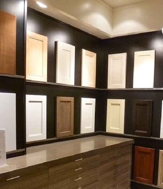
We started with a frameless kitchen construction, which was more wallet-friendly than a more labour-intensive framed kitchen, and chose a classic shaker profile for the doors that wasn’t too fussy. Having the millwork sprayed in Benjamin Moore Cloud White keeps the traditional look fresh and timeless.
Categorized as: Dream Home, Jessica Claire Interiors, Kitchen, Reno, Style At Home
Tagged As: cameo, custom, millwork, organization
Project Glam Kitchen: The Layout
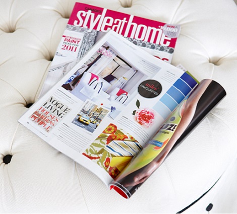
After determining the confines of space I had to work with, I did tons of research, pouring over back issues of Style At Home and revisiting my interior decorating course notes on kitchen planning so I could map out the kitchen of my dreams. I love to cook and entertain so it had to be extremely functional and not just stylish.
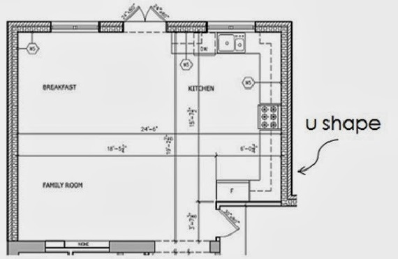
When I looked at the shell of the kitchen, the given elements to work with were: two corners, an island, and a nice large window to place the sink under. After some helpful advice from my former boss, architect Dee Dee Taylor Eustace, I was convinced to remove cabinetry I had initially placed on the shorter wall right by the entrance to the addition so the kitchen would be an L shape and not a U shape. This was great advice because in kitchen planning, corners are the most inefficient use of space, so losing that shorter wall was not a big storage loss. As a result my island could be increased by two feet- valuable square footage when spreading out a buffet for 20!
Categorized as: Dream Home, Jessica Claire Interiors, Kitchen, Reno, Style At Home
Tagged As: cameo

