Project Glam Kitchen: Open Concept Space Planning
After looking up the city zoning laws and determining how many square feet we could add on to the house, the planning stage kicked in. The architect initially presented us with a layout for a kitchen with no island and then after that, a larger space with a support column stuck smack in the middle of it, neither of which I was on board with.
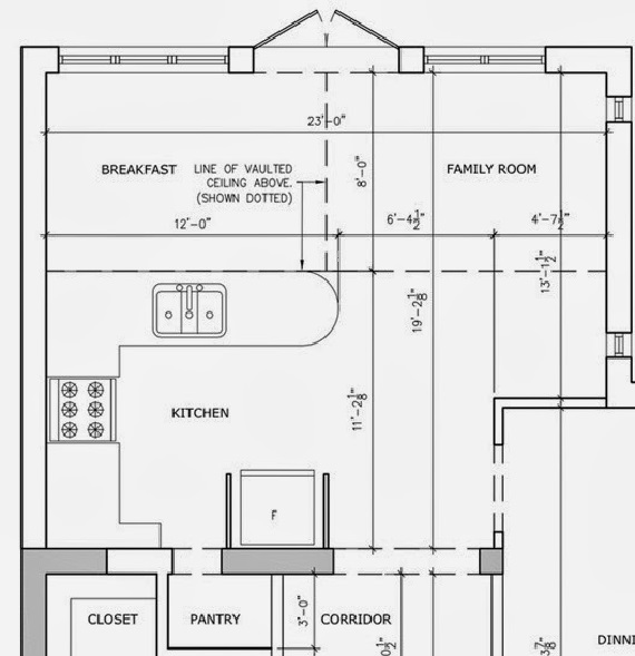
I decided to take a more hand’s on approach to the entire design of the home and not just the decorating aspect, which is what I normally stick to, and ended up changing the proportions so I could fit in a large L-shaped kitchen with an island, a breakfast table, as well as a family room- with no support column in sight!
And why was I was so hung up on not having a column in the middle? Because the whole point of the addition was to have a wide open informal space to function as the hub of the home. Whether cooking up a storm, watching TV, eating a nice meal or just pulling up a stool to the island for a snack, I knew it would be the ultimate hang-out destination in the house. Having a column in the centre would not only disrupt the flow, but would also be a terrible eye sore and prevent me from having nice uninterrupted sightlines throughout the space.
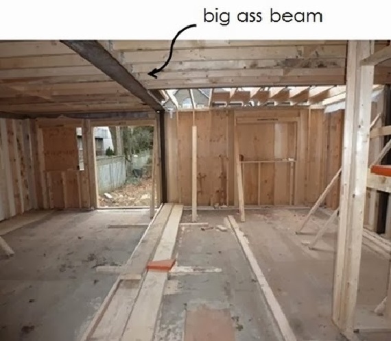
After a lot of back and forth with the structural engineer, it was determined a heavy-duty beam would be sufficient to carry the support load, but this also meant having it drop down from the ceiling, which isn’t high to begin with. My creative solution was to hide the beam it in a coffering treatment, which looks sophisticated and adds nice architectural detail to the space. The coffering runs alongside the perimeter of the addition (with the exception of over the windows, French doors and the kitchen range hood), as well as divides the family room from the breakfast area. You’d never know which parts are hollow and which are hiding important structural supports.
With a wide open space, the task of assigning zones commenced with the kitchen on the right side and the family room and breakfast area on the left side, with a clear pathway to the backyard door in between.
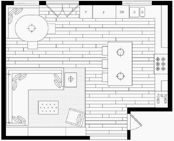
To maximize seating in the breakfast area in the back left corner, I decided on a banquette that would be comfortable for lounging and eating. An oval table ensured it would be easy to get up and exit the banquette from both sides, and it also left enough space for the set of double French doors to the backyard to fully open when entertaining.
The family room area is compact and cozy but can still seat a crowd thanks to the custom sectional. Opposite the sofa is built-in millwork to house the TV with plenty of open shelving for display of family photos and treasured tchochtkes above, and closed storage below.
With the different zones complete, it was now the time to get into the nitty gritty details and plan the perfect kitchen.
Up next: kitchen layout
Categorized as: Dream Home, Jessica Claire Interiors, Kitchen, Reno, Style At Home
Tagged As: addition, architecture




POST A COMMENT